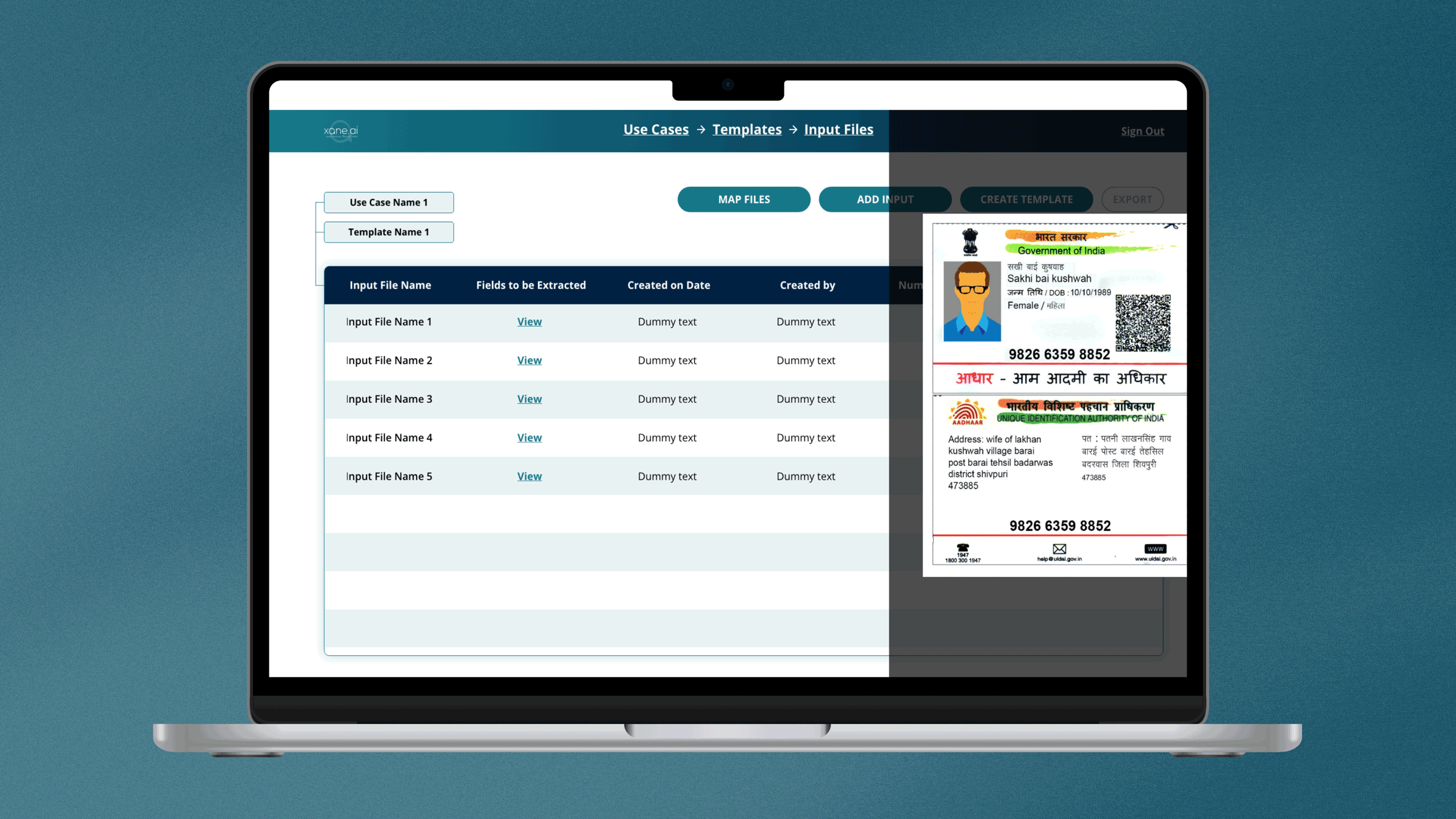
Xane AI | Designed in 2022
OCR
Visual design for a AI platform that enables users to extract data using optical character recognition
Please note that due to an NDA only limited information and very few images can be shown for this project

Xane AI | Designed in 2022
OCR
Visual design for a AI platform that enables users to extract data using optical character recognition
Please note that due to an NDA only limited information and very few images can be shown for this project
Overview
OCR stands for Optical Character Recognition1. It is a technology that recognizes text within a digital image. It is commonly used to recognize text in scanned documents and images. The Xane OCR software was designed for companies to enable them to extract text from thousands of documents easily and quickly.
My Role
As a UI and UX designer, I worked on the user experience and UI design closely with the Founders, CEO and CTO, and developers to build the MVP.
Deliverables
User flows
Wireframes
Final UI designs
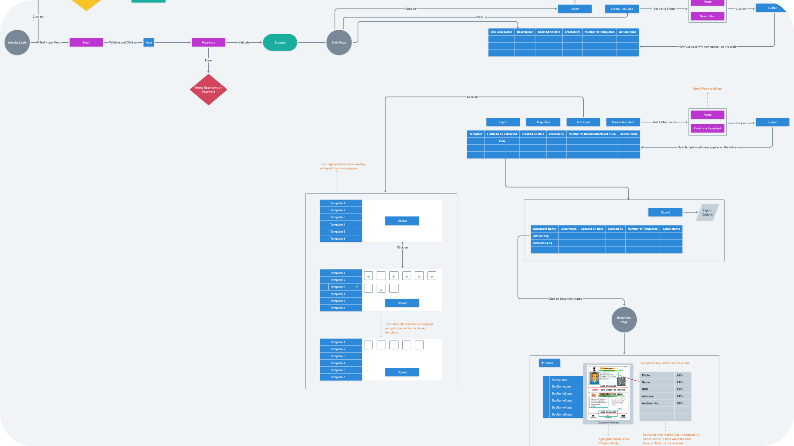
Organization Goals
Bulk Data Extraction
To create a mobile app that would enable their customers to be able to self diagnose any problems with their car using AI.
Foolproof Extraction
To reduce human errors and extract information in a foolproof manner
Customised User Cases
To enable the companies to create their own customised use cases and extract the information they need
My Process
This was a time-box project and the client knew exactly what they wanted to create. I started the design journey by gaining a deeper understanding of the solution that the clients wanted to execute as well as the users requirements.
It can take hours for users to manually go through documents and extract the information required in an efficient and foolproof manner.
The use cases for this software are far and wide. One example of a user can be an HR executive that has to onboard new employees and manually enter data from a candidate's documents. Not only is this time-consuming, but this method can also very often be error-prone.
Customised Mapping
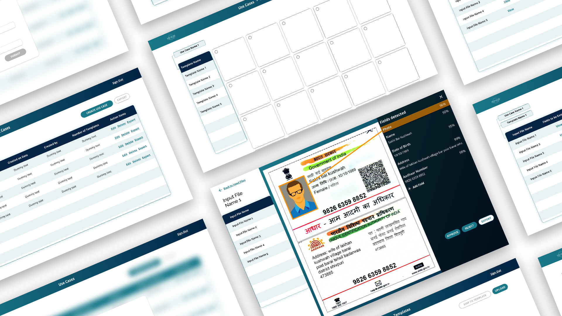
The software proposed would make it easy to import scanned images in bulk,
create customised use cases and extract the exact information required.
It would also make the method of mapping pictures to various templates easy.
K.I.S.S (Keep it simple, stupid)
The software was created using a very clean and minimal aesthetic keeping in with the brand colours. It manages to show the information required in a precise manner with a clear navigation bar. There was a clear hierarchy required to be shown to make it clear to the users exactly what information is being accessed by them. All the options that are available to the user have also been laid out clearly.
Other Projects